 From the Economist.
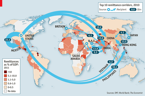
I just love global maps indicating flows - naturally.
What do we see here?
Per my vernacular, in sheer volumen we see New Core being fed remittances by expats living in Old Core. But when it comes to countries relying heavily on remittances as percentage of GDP, it tends to be mostly Old/some New Core and it all pretty much goes to Gap countries.
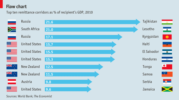
Per my flow concept: whatever the resource, it flows from regions where it is plentiful (here, earning opportunities) to where it is less so. Yes, we think of India, China, Mexico as New Core and thus "made," but all share the reality of significant numbers of rural poor. In truth, in most New Core countries, there is massive internal remittances flows.
What I love about this: this is the best foreign aid there is, because people use it as they see fit.
You may say to yourself: What a drain on Core - especially US!
Studies have shown, however, that expats living in new countries spend something like 90% of their earnings in-country, sending about 1/10th home. It's just that those flows still number in the billions, swamping anything we do on official developmental aid.