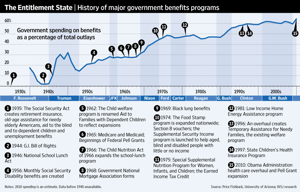
WSJ story on "obstacles to deficit cutting."
Tempting to look at administrations and spot oddities (Ike and Nixon and GW Bush--all up! but JFK and LBJ barely rise!), but you know it can't be all that simple (time lags for new policies to take effect, other more important factors like demographic changes).
Still, an undeniable trend. Automatically bad? I always like to point out that states that send more tax dollars to DC and receive less tend to shade Blue while states that eat more tax dollars than they provide tend to tint Red, so I'm always reticent to assume political identification--and thus corresponding judgment--on this basis.
I suspect that, in order of magnitude, it's the aging factor first, then the healthcare burden and then breakdown of the family.
So are we as "socialist" as we imagine ourselves to be?
Check out this second chart:
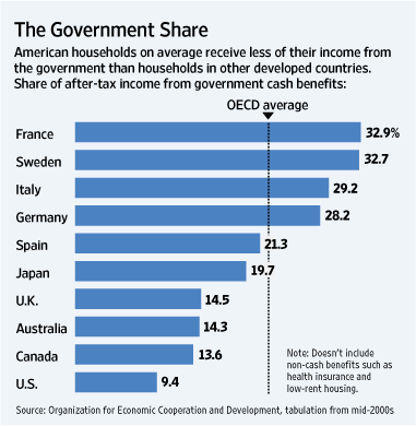
Oh well, I suppose we can always try harder.
As the "virus" of socialism goes, it appears we have the swine flu variety: spread widely but thinly.