 Economist chart explaining why Obama feels little love over the recovery.
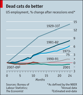
Compared to previous recoveries, this one is bested only by 2001 as being weaker on job hiring.
Seems to be a pattern in the sense that the best recovery was when we were a far less mature economy, the middlng ones were decades ago, and the worst ones happened in the last decade.
The Economist's verdict: "Not since records began has so deep a recession been followed by so shallow a recovery in employment"--as in, "slightly fewer Americans are working now, a full year into the recovery, than when the recession ended in the middle of 2009."
So the recovery is what? Fewer workers working a lot harder.
And that does not equate into political love for anybody.