From WSJ column by David Wessel--always good.
This is the most interesting demo slide I've seen in a long while. Already put it into the brief.
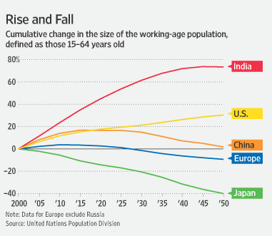
What I note:
- the decline of Europe and Japan (almost off the chart--pun intended)
- how closely China's trajectory mirrors Old Core Europe
- America as Old Core outlier without peer
- India's fantastically long "golden hour" of declining ratio of dependents to workers--much longer than China's was.
But it's the numbers that jump out at you. Between now and 2050 we add 35m workers, China loses 100m and India gains 300m.